
When Two Dimensions Demand Three-Dimensional Madness
Franco-Belgian comics do not merely tell stories through drawings. They establish a visual contract with the reader, one built from elastic bodies, emphatic silhouettes, impossible timing, and faces that can turn a raised eyebrow into a full-scale theatrical event. Bringing that contract into live action is therefore less like translating a novel than staging a drawing that has suddenly acquired weight, texture, and gravity. The camera may be real, the costumes may be physical, and the actors may occupy actual locations, but the governing logic remains gloriously artificial.
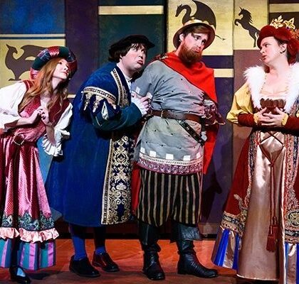
This is the central challenge facing any adaptation of the European bande dessinée, from the broad comic world of Iznogoud to the indomitable Gauls of Asterix. The familiar gros nez, or “big nose,” tradition depends on exaggeration rather than anatomical plausibility. Its characters move with the snap of a cartoon, collide without surrendering their dignity, and inhabit colour as boldly as they inhabit dialogue. Successful live-action versions must therefore embrace theatrical excess, saturated design, and comic-book physics. Hollywood”s instinct to explain fantasy through sober naturalism can be useful for some superheroes, but here it often drains the ink from the page.
The Gros Nez Dilemma and the Limits of Naturalism
American superhero cinema has spent decades refining a particular adaptation strategy. Costumes become tactical armour, extraordinary abilities receive quasi-scientific explanations, and fantastic characters are placed against recognisably modern environments. Even when the premise is flamboyant, the image is frequently disciplined by gritty lighting, muted colour, and an emphasis on physical plausibility. Franco-Belgian caricature begins from almost the opposite position. A moustache is not merely facial hair; it may be a character”s flag, weapon, social status, and punchline. A cape does not need to look wearable when its purpose is to announce vanity, authority, or impending disaster.
The uncanny valley appears when production design acknowledges the source material halfway. Put an oversized prosthetic nose beneath subdued, realistic lighting, and the result can look less like a comic brought to life than an actor trapped inside an expensive joke. Add a brilliantly coloured cape to a dusty, naturalistic location, and the costume begins to float apart from the world rather than define it. The same problem affects performance. If the actor delivers exaggerated dialogue with restrained, psychologically realistic gestures, the visual signals conflict. The audience sees a caricatured body asking to be read as a conventional dramatic person.
The visual spectrum within Franco-Belgian comics is broad, however, and not every work uses exaggeration in precisely the same way. The clean, controlled line of ligne claire favours clear contours, legible spaces, and an almost architectural precision. Its apparent simplicity can demand considerable discipline in live action, because every prop, horizon, and colour block must remain intelligible. Other traditions lean more heavily into distorted anatomy, kinetic poses, dense background jokes, or grotesque facial design. The adaptation question is not whether to copy every drawing literally, but which visual principle must govern the screen.
- Line clarity requires clean compositions, readable silhouettes, and carefully controlled production design.
- Caricature requires actors who can project through posture, facial rhythm, and physical timing rather than merely wearing prosthetics.
- Comic velocity requires editing and staging that preserve the snap between setup, impact, reaction, and escalation.
- Colour logic requires costumes, sets, and lighting to work as expressive signs instead of decorative realism.
Mission Cléopâtre and the Triumph of Theatrical Farce
Alain Chabat”s Asterix & Obelix: Mission Cléopâtre offers one of the clearest demonstrations that live-action European comics can thrive when they stop apologising for their artificiality. Released in 2002, the film sends Asterix and Obelix to Egypt, where Cleopatra challenges Caesar by ordering an enormous palace to be built in an absurdly short time. The premise is already comic-strip material: political rivalry becomes architectural competition, historical figures share space with cartoon villagers, and every logistical obstacle is an invitation to escalate the joke.
Chabat”s achievement lies in understanding that the film does not need to make this world credible in a sober historical sense. It needs to make the world internally playful. Monica Bellucci”s Cleopatra possesses star glamour without being isolated from the farce, while Jamel Debbouze”s performance gives the construction plot a nimble, restless centre. Gérard Depardieu”s Obelix is physically imposing but emotionally direct, a perfect comic counterweight to Asterix”s sharper precision. Celebrity appearances and anachronistic humour become part of the film”s texture rather than distractions from it.
The film also recognises that a comic adaptation can make the audience aware of its own machinery. Fourth-wall gestures, sudden tonal pivots, visual asides, saturated colours, and vaudevillian acting all honour the spirit associated with René Goscinny and Albert Uderzo. The result feels less like a museum reconstruction of an album than a stage spectacle with a vast budget and an unusually energetic camera. By contrast, more literal live-action interpretations can become rigid, preserving character names and plot ingredients while losing the timing that made the panels breathe.
| Adaptation choice | Effect on the audience |
|---|---|
| Saturated colour and bold costume design | Maintains the graphic identity of the comic world |
| Vaudevillian performances | Turns character traits into visible comic action |
| Rapid reversals and visual asides | Preserves the surprise of panel-to-panel storytelling |
| Controlled historical anachronism | Allows satire and contemporary comic rhythm to remain alive |
When Ambition Overheats in the Grand Bazaar of Iznogoud
Patrick Braoudé”s 2005 adaptation of Iznogoud illustrates the danger on the other side of the equation. The film is built around a character whose entire identity is a comic obsession with becoming caliph in place of the caliph. That premise demands visual instability, verbal repetition, palace intrigue, and a world where political ambition is as ridiculous as it is relentless. In theory, it is ideal material for a heightened screen style. In practice, the adaptation”s ambition can feel scattered, as if every decorative impulse has been invited to the same banquet and nobody has been given a seating plan.
The production pushes toward a pseudo-Bollywood spectacle, with conspicuous music, ornate settings, flamboyant costumes, and a general appetite for excess. Yet excess only becomes comic when it is shaped by rhythm and character. If the songs do not sharpen the plot, if the sets feel uneven, or if the lighting flattens rather than illuminates the spectacle, the film”s artificiality stops feeling deliberate. Critical responses to the movie have singled out awkward songs, weak visual polish, and especially unconvincing moustaches, an unfortunate weakness in a universe where facial hair carries so much comic information.
The lesson is not that adaptation should become less extravagant. It is that extravagance needs a spine. Iznogoud demonstrates how easily cartoon energy can turn into tonal disorientation when spectacle outruns narrative stakes. The audience must understand what the protagonist wants, why each obstacle matters, and how every visual gag advances the comic machinery. A palace can be dazzling, but the viewer still needs to know which door the schemer is trying to open.
- Give every spectacle a dramatic function. A song, costume change, or visual flourish should reveal ambition, intensify conflict, or redirect the story.
- Protect the central comic objective. The protagonist”s desire must remain legible beneath the noise of cameos, set pieces, and ornamental detail.
- Build choreography around escalation. Each gag should complicate the previous one rather than arrive as an isolated burst of activity.
- Make artificiality precise. Deliberate camp requires control of colour, sound, editing, and performance, not simply more of everything.
Essential Rules for Translating Ink Slapstick to the Big Screen
Comic-strip physics cannot be created by costumes alone. It emerges from the cooperation of performance, camera placement, lighting, sound, production design, and editing. An actor playing a caricatured character must understand the silhouette as a complete sentence. A pause can function like a panel border. A sideways glance can carry the force of a caption. A collision becomes funnier when the staging gives the audience a clear beat before impact and a sharply composed reaction afterward.
The most convincing adaptations also resist the temptation to hide the seams. Expressive lighting should preserve the colour architecture of the source, while heightened costumes need to communicate personality before dialogue begins. Rhythmic editing should respect the logic of setup and payoff, but it should not chop action into anonymous fragments. The camera must give bodies room to perform. When every movement is visible, slapstick becomes choreography rather than mere noise.
- Identify the governing graphic style. Decide whether the source depends primarily on clean line, grotesque caricature, saturated colour, architectural detail, or kinetic distortion.
- Design silhouettes before textures. A character should be recognisable in shadow, at a distance, and in the middle of a crowded composition.
- Translate panel rhythm into scene rhythm. Establish the joke, hold the audience”s expectation, deliver the impact, and allow the reaction to land.
- Use lighting as comic punctuation. Shadows, colour shifts, and theatrical highlights should clarify mood and emphasis rather than imitate prestige drama.
- Let actors play outward. Facial expression, posture, gesture, and vocal cadence must be large enough to meet the world”s visual scale.
- Keep narrative stakes visible. Even the most extravagant gag works better when the audience knows what success, failure, or humiliation means for the characters.
Embrace the Absurd or Leave the Pages Unturned
Franco-Belgian comics lose their particular voltage when their eccentricity is forced to pass through the filter of sombre studio naturalism. The problem is not realism itself. Real locations, practical costumes, and physical performances can make these worlds wonderfully tactile. The problem arises when realism becomes a corrective, sanding down the oversized noses, loud colours, broad gestures, and impossible momentum that gave the original work its identity.
Visual excess is not a campy flaw to be tolerated on the way to seriousness. It is a deliberate artistic choice, one that can turn adaptation into a true meeting between ink and flesh. The strongest filmmakers will treat artificiality as a form of honesty. They will build coherent worlds where moustaches may be political weapons, palaces may behave like stage machinery, and historical figures may tumble into slapstick without losing their dramatic purpose. To honour European comic history, the next generation of directors should not ask how to make these pages look ordinary. They should ask how daringly artificial the screen can become while keeping every joke, character, and story beat alive.